Egg & Shell Case Study
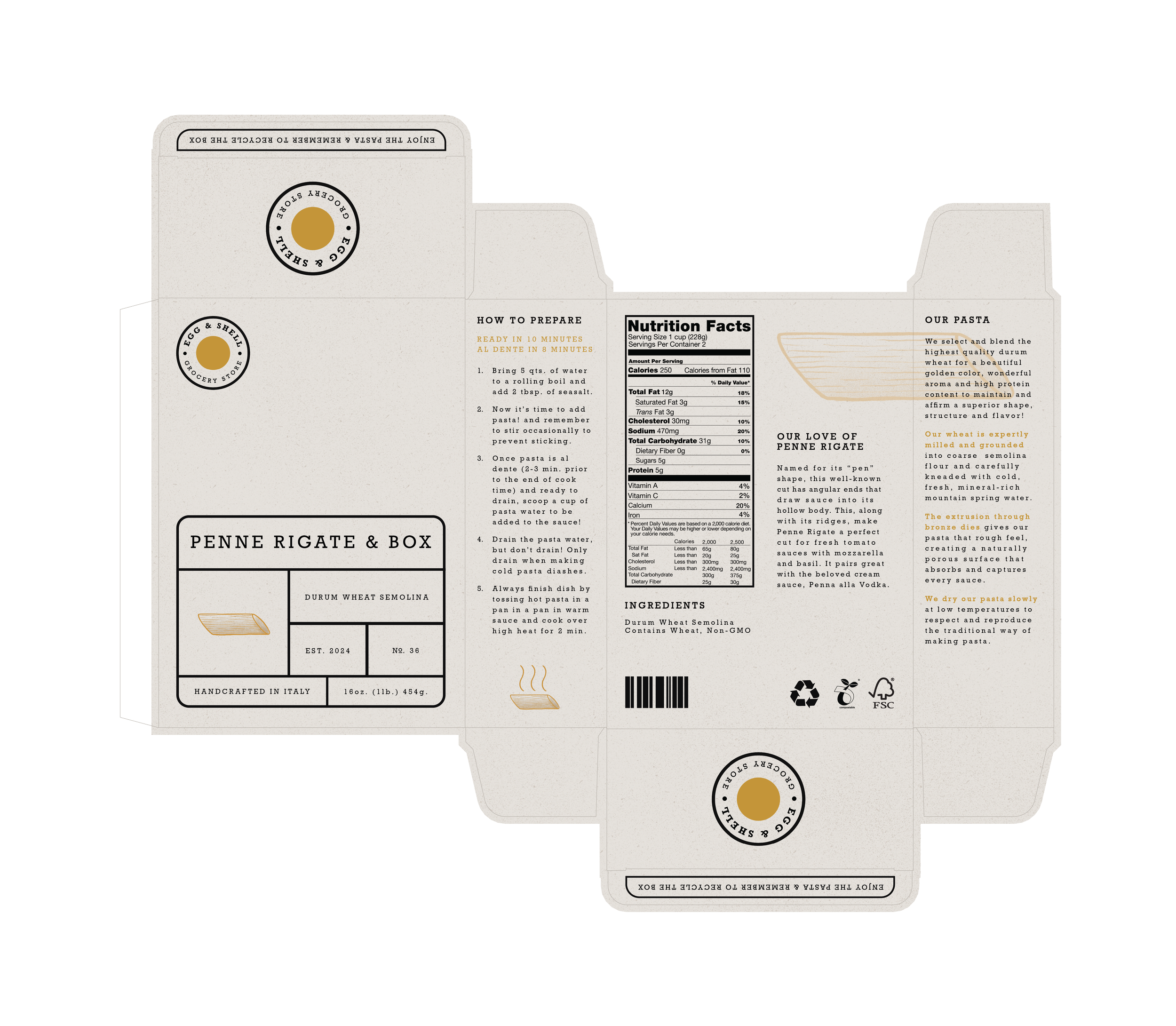
This showcases my brand design for a hypothetical grocery store. The goal of this project was to develop and design an integrated brand for a novel grocery store through the development of brand and creative briefs, brand identity, packaging systems, information/promotional programs, and brand environment. The brand that I leaned into provides an immersive grocery shopping experience, with two goals in mind. First, they promise to offer a great selection of well-priced, quality products that serve the health and wellness needs of our customers. In addition, all of the products are packaged in compliance with a convenient and reliable closed-loop in-store recycling customer redemption program, with 100% recycled or reusable materials. The mission is to embrace a high-quality, fully sustainable shopping experience with 0% waste.
The name Egg & Shell represents the core purpose/mission statement of the brand. We focus on providing high-quality products, while also considering the packaging that it comes in. An egg is a food product that comes in its own “package” since the shell can be seen as a package for the egg (food product), acting as a representational metaphor. The shell of an egg is also something that is natural/sustainable and can be composted, representing the closed-loop zero waste system. Every part of an egg can be used.
Time
10 Weeks
Tools
InDesign
Illustrator
Procreate
Area of Focus
Brand Identity
Packaging Design
Logo/Mark Design
Environment Design
Promotion


